

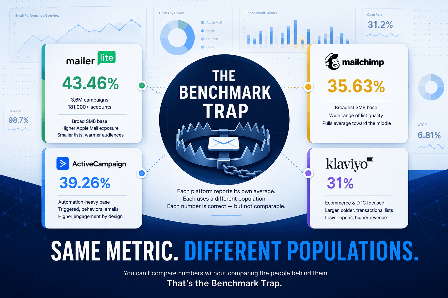
Pull up four benchmark reports right now — MailerLite, ActiveCampaign, Mailchimp, and Klaviyo — and you’ll get four very different answers to the same question:
What’s a normal email open rate in 2026?
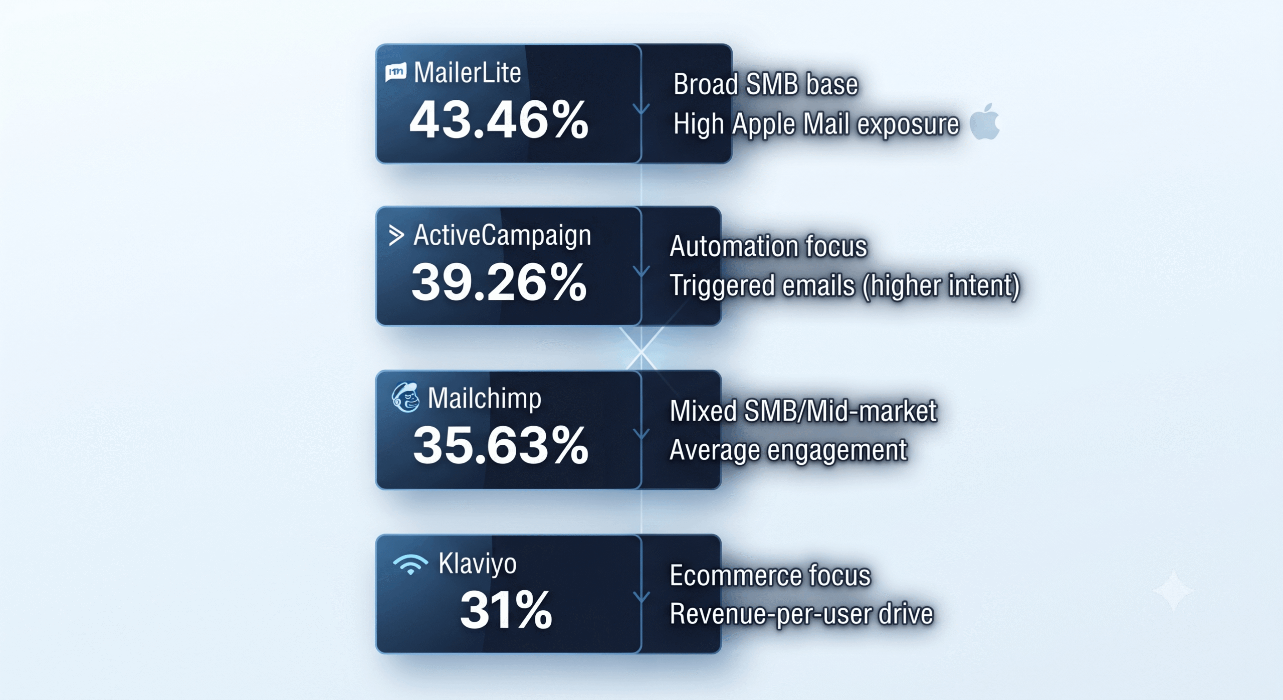
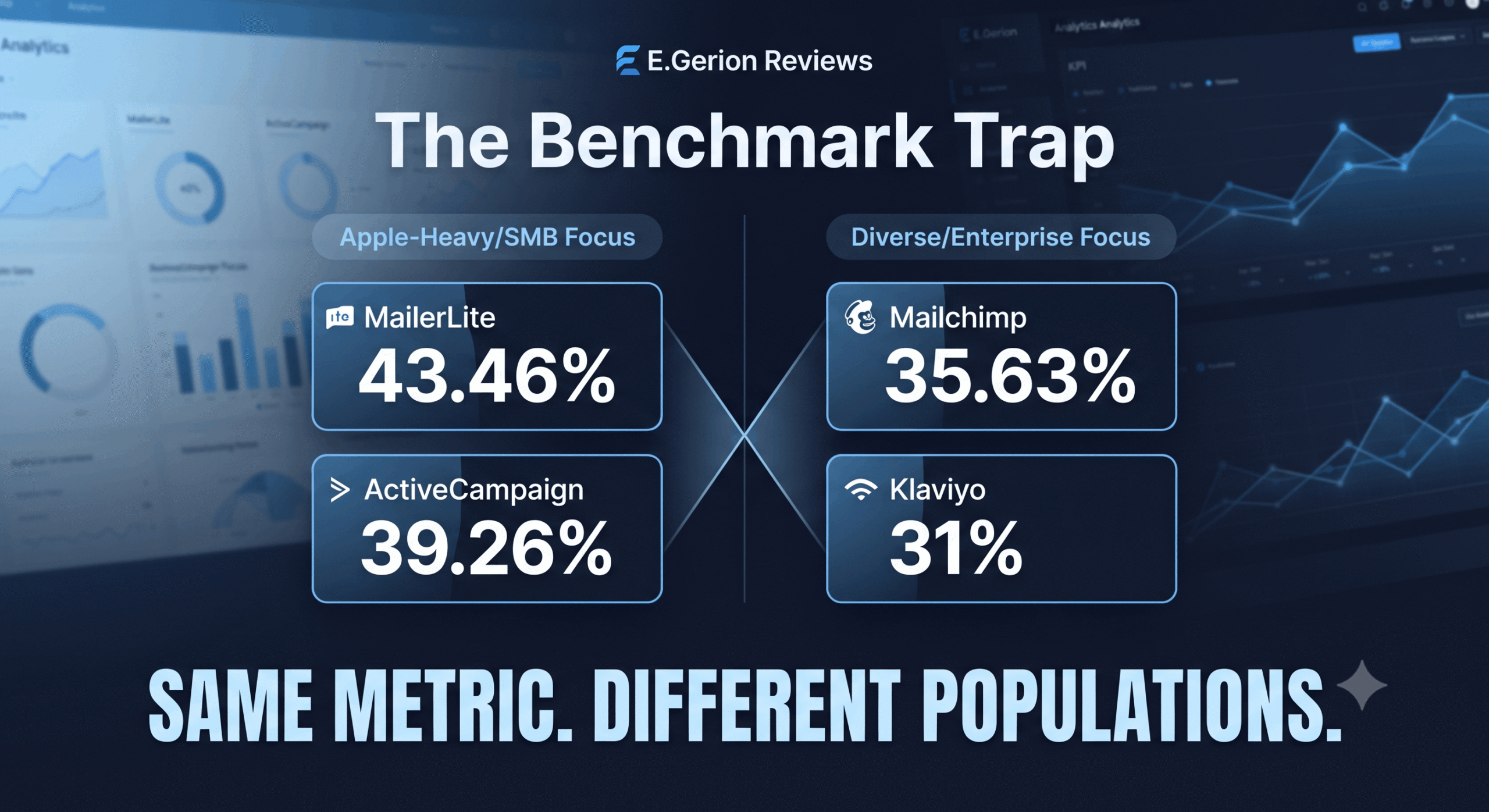
MailerLite reports 43.46%. ActiveCampaign reports 39.26%. Mailchimp reports 35.63%. Klaviyo reports 31% for email campaigns.
At first glance, this looks like a twelve-point disagreement about the same metric.
It isn’t.
Same metric name. Four different datasets. Different methodologies. Different reporting periods. A twelve-point spread.
And here’s the part benchmark articles usually leave out: these numbers aren’t even built from the same time period.
MailerLite’s benchmark uses more than 3.6 million campaigns from December 2024 through November 2025 and reports median values. ActiveCampaign’s 39.26% comes from customer campaigns sent between January 1 and December 10, 2025. Mailchimp’s widely quoted 35.63% comes from data last updated in December 2023. Klaviyo’s 31% comes from its 2026 benchmark analysis of more than 183,000 brands and refers specifically to email campaigns.
So if you’re a marketing manager trying to explain to your CEO why your open rate “underperforms the industry average,” you have a real problem.
There is no single industry average.
There are platform-specific datasets, different customer populations, different statistical methods, different periods, different campaign mixes, and — sitting over all of them — Apple’s Mail Privacy Protection.
I call this the Benchmark Trap: taking one company’s benchmark, stripping away the context of who was measured, when they were measured, and how the number was calculated, and then treating that result as a universal law of email performance.
The number itself may be perfectly legitimate.
The comparison may not be.
Last year I sat in a strategy call where a founder was ready to replace their entire email team over a 28% open rate on their Klaviyo dashboard. (Details changed to protect client confidentiality; the dynamic itself is one I’ve seen repeat across multiple accounts.)
Someone on the team had pulled a “best practices” article quoting a much higher benchmark as gospel.
Next to that number, 28% looked like a disaster.
It wasn’t.
Once we normalized the comparison for platform, audience type, and measurement context, the account was performing within a reasonable range for its market. The team survived.
The number almost cost three people their jobs.
That is what happens when a benchmark stops being context and starts being treated as a verdict.
The Problem Nobody Explains Properly
Here’s what actually happened to open rate as a metric, and it starts with Apple.
Apple introduced Mail Privacy Protection in 2021. When Protect Mail Activity is enabled, Apple can download remote email content in the background when a message is received rather than waiting for the recipient to view it. Apple also routes that remote content through privacy-preserving relays.
For email marketers, that creates a fundamental measurement problem.
A tracking pixel can be requested even when the recipient hasn’t consciously opened the email.
Your automated welcome email can sit unread in someone’s inbox for three days, while the tracking infrastructure has already registered an open.
The dashboard sees an open.
The human may never have looked at the message.
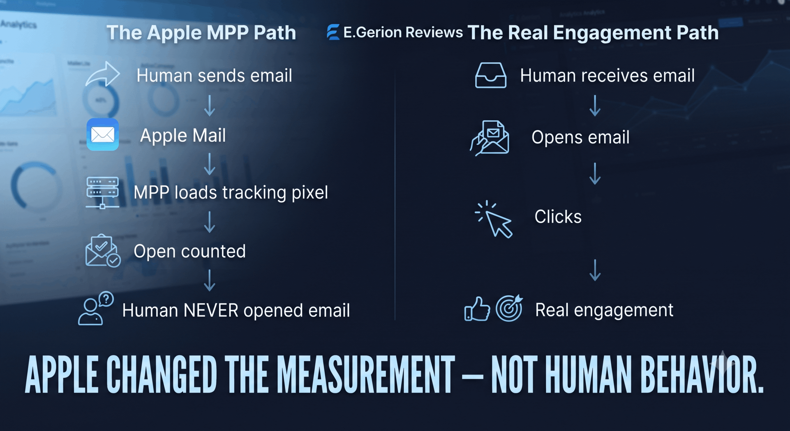
That doesn’t mean every Apple open is fake. It means the open event can no longer reliably tell you whether a person actually read the email.
And that distinction matters.
MailerLite explicitly warns that Apple Mail Privacy Protection inflates reported opens and also affects CTOR because the denominator contains those inflated opens.
Klaviyo makes essentially the same point in its 2026 benchmark report: open rate isn’t completely reliable because Apple can register an open whether or not the recipient actually opens the message. Klaviyo recommends treating it as a directional metric rather than a perfect measure of engagement.
The scale of the distortion can be significant. Estimates commonly put the inflation in the range of roughly 15–20 percentage points for heavily affected audiences, although the actual impact depends on the composition of the list and how the platform handles privacy-generated opens.
But there’s an important nuance here.
Apple didn’t suddenly make email marketers incapable of measuring anything.
It exposed how much confidence we had placed in a metric whose underlying measurement mechanism was already imperfect.
Before MPP, an open generally meant that the tracking pixel had been loaded after the message was viewed.
After MPP, the same event can represent several very different things:
A person opened the email.
Apple fetched the remote content automatically.
A proxy requested the content.
Or some combination of those events occurred.
The number in the dashboard looks precise.
The behavior behind the number isn’t.
Four Platforms. Four Different Ways of Measuring “Normal”
This is where the Benchmark Trap gets interesting.
Let’s look at what those four headline numbers actually represent.
MailerLite: 43.46%
MailerLite’s 2026 benchmark is based on more than 3.6 million campaigns from 181,000 approved accounts.
The dataset covers December 2024 through November 2025, and MailerLite reports median values across its benchmarks. The overall median open rate is 43.46%.
That word — median — matters.
A median tells you the middle value in a distribution. Half of the observations sit above it and half below it.
It is less sensitive to extreme outliers than a mean.
So MailerLite’s 43.46% isn’t simply “the average email open rate.” It is the median open-rate benchmark generated from a very large population of campaigns.
That’s a very different statement.
ActiveCampaign: 39.26%
ActiveCampaign reports an average open rate of 39.26% based on customer campaigns sent between January 1 and December 10, 2025.
That’s a mean-style average rather than the median methodology MailerLite explicitly describes.
And the dataset is different.
ActiveCampaign’s customer base is different.
The campaign mix is different.
The reporting window is different.
So comparing 43.46% and 39.26% as though two scientific laboratories measured exactly the same population is already a methodological mistake.
There is another important distinction: ActiveCampaign says its benchmark data comes from campaigns across different industries and customer types, and its click-rate benchmark includes transactional, marketing, and other campaign types.
That matters because what gets included in a benchmark changes the benchmark.
Mailchimp: 35.63%
Mailchimp reports an overall open rate of 35.63%.
But here’s the detail most benchmark roundups don’t tell you:
Mailchimp’s public benchmark page states that the data was last updated in December 2023. It also warns that Apple Mail Privacy Protection can affect open-rate accuracy.
So using Mailchimp’s 35.63% as a direct “2026 average” alongside newer datasets is problematic.
The number can still be useful as a historical benchmark.
It simply shouldn’t be presented as though Mailchimp measured the same 2026 population as Klaviyo.
That’s exactly the kind of context the Benchmark Trap removes.
Klaviyo: 31%
Klaviyo’s 2026 benchmark is based on data from more than 183,000 brands.
Its overall average email campaign open rate is 31%, with the top 10% of performers reaching 45.1%.
And there’s another important distinction here.
Klaviyo separates campaigns from automated flows.
Campaigns are one-off marketing sends. Flows are behavior-triggered sequences such as welcome emails, abandoned-cart messages, post-purchase sequences, and other lifecycle automations.
Those are not interchangeable forms of email.
Klaviyo reports that automated flows significantly outperform campaigns on clicks and placed-order rates, with flows generating nearly 41% of email revenue from only 5.3% of sends in its 2026 dataset.
So when someone says “Klaviyo’s open rate is 31%,” the next question should immediately be:
31% for what?
The answer is campaign email.
That distinction alone prevents a lot of bad benchmarking.
The Second Trap: Mean vs. Median
This is one of the simplest methodological differences, and one of the most frequently ignored.
MailerLite reports a median.
ActiveCampaign reports an average.
Those aren’t interchangeable statistical descriptions.
Imagine ten accounts with open rates ranging from 20% to 50%, plus one unusually high account at 95%.
A mean will be pulled upward by that extreme value.
A median largely ignores its influence.
Now reverse the problem.
Imagine a dataset containing many poorly maintained or low-engagement accounts.
A mean can be pulled downward by those lower-performing observations.
The point isn’t that one method is “correct” and the other is “wrong.”
The point is that they answer slightly different questions.
MailerLite’s 43.46% tells you where the middle of its campaign distribution sits.
ActiveCampaign’s 39.26% tells you the arithmetic average across its customer campaign data.
That methodological choice can explain part of the spread before audience composition even enters the picture.
And that’s the important lesson.
When you see a benchmark, don’t ask only:
“What is the number?”
Ask:
“What statistical operation produced the number?”
That one question can completely change how you interpret the result.
The Third Trap: Customer Population
The other major variable is who actually uses each platform.
Klaviyo is heavily associated with ecommerce and DTC marketing.
MailerLite serves a much broader SMB market.
ActiveCampaign has a strong automation and CRM orientation.
Mailchimp serves an exceptionally broad range of businesses, from very small companies to large organizations. Mailchimp itself says its customer population ranges from one-person startups and small businesses through Fortune 500 companies.
That means the underlying populations aren’t interchangeable.
And different industries behave differently.
MailerLite’s 2025 dataset, for example, reports open-rate benchmarks ranging from around 30% in travel and transportation to more than 55% in religion. Ecommerce sits at 32.67%.
ActiveCampaign’s customer data similarly shows substantial variation: 43.16% for media and publishing, 42.68% for nonprofits, 35.66% for ecommerce and retail, and 36.20% for software.
So if Platform A has a higher concentration of industries with naturally high engagement and Platform B has a higher concentration of large ecommerce databases with more transactional or inactive subscribers, their overall averages can diverge substantially.
That’s not a reporting error.
It’s population composition.
The benchmark is partly telling you about the customers using the platform.
Not just about the quality of the email technology.
The Fourth Trap: The Reporting Period Isn’t the Same
This one deserves more attention than it usually gets.
Look at the four numbers again.
MailerLite: December 2024–November 2025.
ActiveCampaign: January 1–December 10, 2025.
Mailchimp: public benchmark data last updated December 2023.
Klaviyo: 2026 benchmark dataset based on more than 183,000 brands.
Now ask yourself:
Would you compare four financial reports if one covered 2025, another covered January–December 2025, another was last updated in 2023, and another represented a newer 2026 dataset?
Probably not.
Yet that’s exactly what marketers routinely do with email benchmarks.
They put four percentages into one table.
Then they call the result a comparison.
It isn’t.
It’s a collage.
And once you see that, the headline numbers become much less mysterious.
Why This Matters for CEOs, Not Just Marketers
This isn’t a marketer’s problem alone.
It’s a budget problem.
And it moves surprisingly fast up the org chart.
A CEO who believes a 28% open rate is dramatically underperforming may authorize a platform migration, fire an agency, restructure an internal marketing team, or demand a complete email strategy overhaul.
All based on a benchmark that may not be directly comparable to the company’s own data.
I’ve watched versions of this sequence play out.
Someone brings a benchmark into a leadership meeting.
The internal dashboard shows a lower number.
The conclusion becomes:
We’re underperforming.
The next question becomes:
What’s wrong with the platform?
And suddenly you’re discussing a six-figure migration.
The expensive version of the Benchmark Trap isn’t a marketer feeling bad about their numbers for a week.
It’s a signed contract with a new ESP.
A migration project that consumes months of team time.
New integrations.
New templates.
New tracking.
New deliverability risks.
And then, after all that work, the same audience produces almost exactly the same real-world engagement.
Because the audience didn’t change.
Only the reporting environment did.
That is an extraordinarily expensive way to discover that your benchmark was wrong.
The Metric That Actually Survived — and the Ones That Didn’t
This is where precision matters most.
Open rate is no longer a clean measure of human attention.
CTR is stronger.
CTOR is useful, but imperfect.
And none of them should be interpreted without context.
Open Rate
Open rate measures tracked opens as a percentage of delivered email.
Apple MPP directly compromises this metric because remote content can be downloaded without the recipient consciously viewing the message.
That doesn’t make open rate useless.
It makes it directional.
A sudden change in your own open rate may still tell you that something changed.
But comparing your 34% open rate against another company’s 43% and declaring yourself 9 percentage points behind is not analytically sound.
CTR
CTR measures clicks as a percentage of total delivered or sent email, depending on the platform’s exact definition.
It requires an interaction with a link rather than simply a tracking pixel being loaded.
That makes it a substantially stronger engagement signal than open rate.
MailerLite explicitly describes click rate as its most accurate indicator of newsletter engagement in the current environment because it isn’t dependent on open tracking.
But even CTR isn’t perfect.
Security systems and automated scanners can generate non-human clicks, particularly in B2B environments. Research summarized by Geysera notes that automated systems can contaminate click data as well.
So I wouldn’t call CTR “pure.”
I’d call it stronger.
That distinction matters.
CTOR
CTOR — click-to-open rate — measures clicks as a percentage of tracked opens.
At first glance, this sounds ideal.
It isolates what happens after someone opens.
But there’s a problem.
The denominator is still open data.
If Apple inflates the number of recorded opens, CTOR can be artificially depressed.
MailerLite explicitly notes this effect: because Apple privacy changes inflate opens, the actual CTOR can be higher than the reported figure.
Geysera makes the same methodological point: CTOR is still useful, but its denominator is affected by MPP.
So I would not call CTOR “broken.”
I would call it directionally useful but unsuitable as a perfectly clean industry benchmark.
That distinction is important enough to repeat.
CTR is the stronger primary engagement signal.
CTOR is a useful secondary diagnostic.
Open rate is a directional signal, not a verdict.
The Consequence Nobody Talks About
The benchmark problem doesn’t stop at reporting.
It changes decisions.
When organizations optimize around an inflated or incomparable metric, they can make poor downstream decisions.
A team sees a low open rate and starts rewriting subject lines when the real problem is deliverability.
Another team sees a high open rate and assumes the content is working when the clicks tell a completely different story.
A healthy automation gets rewritten because it “looks weak” against an unrelated benchmark.
A list gets aggressively cleaned because its open rate appears below an industry average that includes a completely different audience.
A platform gets replaced because its dashboard looks worse than a competitor’s published benchmark.
None of those decisions necessarily improves the customer experience.
Some can make it worse.
The real fix is much less dramatic.
Recalibrate what normal means for your specific audience.
What This Actually Means If You’re Choosing a Platform
This is where the Benchmark Trap becomes more than an argument about statistics.
It directly affects how you evaluate an email platform.
If you’re comparing Klaviyo to ActiveCampaign and using open rate as the deciding factor, you’re comparing different customer populations, different campaign mixes, different reporting periods, and different methodologies.
That’s not a platform comparison.
It’s a measurement comparison.
I’ve seen teams migrate platforms chasing a “better” benchmark, only to discover that their real-world engagement barely changed.
Because the platform wasn’t the variable they thought it was.
The audience was.
The offer was.
The segmentation was.
The automation strategy was.
The measurement methodology was.
Before you let a benchmark influence a platform decision, I recommend applying what I call Benchmark Normalization.
The process is simple.
Step 1: Identify the dataset.
Who is actually being measured?
SMBs? Ecommerce brands? Enterprise senders? A specific vertical?
Step 2: Check the reporting period.
Is the data from 2026?
2025?
2023?
Are you comparing current data with historical data?
Step 3: Check the statistical method.
Is it a mean?
A median?
A weighted average?
Does the report actually tell you?
Step 4: Check the email type.
Campaigns?
Automated flows?
Transactional emails?
Or a mixture?
Step 5: Check MPP handling.
Does the platform filter Apple-generated opens?
Does it disclose how privacy-generated events are treated?
Step 6: Compare like with like.
Only after those questions have been answered should you compare your own performance with the published number.
Skip those steps and every comparison you make afterward is built on sand.
Why Klaviyo’s 31% Doesn’t Mean Klaviyo Is Worse
This is worth stating explicitly because benchmark numbers can create a very misleading impression.
Klaviyo’s 31% campaign open rate does not mean Klaviyo’s email technology is producing worse engagement than a platform reporting 39% or 43%.
Klaviyo’s benchmark is specifically separating campaigns from automated flows.
And the performance difference between those two email types is enormous.
In Klaviyo’s 2026 data, automated flows average a 5.58% click rate, compared with 1.69% for campaigns, and flows generate nearly 41% of email revenue from only 5.3% of sends.
That’s a much more interesting business story than whether campaigns open at 31% or 39%.
Because the point of email marketing isn’t to manufacture impressive open-rate screenshots.
It’s to produce meaningful customer action.
Clicks.
Orders.
Revenue.
Retention.
Repeat purchases.
And profitable customer relationships.
An ecommerce platform that is optimized around those outcomes should not necessarily be judged by whether its campaign open-rate benchmark is the highest number on the internet.
That’s the wrong question.
My Take
I don’t think these four companies are lying.
I don’t even think benchmark reporting is inherently bad.
Benchmark data can be extremely useful when it’s interpreted correctly.
The problem begins when a platform-specific number gets stripped of its methodology and promoted as a universal industry standard.
That’s when a useful reference point becomes a misleading comparison.
The biggest mistake in email marketing today isn’t chasing a higher open rate.
It’s believing that one benchmark can describe every business.
It can’t.
Numbers don’t become useful because they’re large. They become useful because they’re comparable.
And the four numbers at the beginning of this article were never directly comparable in the first place.
One is a median.
Another is an average.
One public dataset is substantially older than the others.
One benchmark specifically separates campaigns from automated flows.
And all of them exist in an environment where Apple has fundamentally changed what an “open” can represent.
That’s not a reason to throw benchmarks away.
It’s a reason to read them properly.
So stop asking:
“What’s the industry average?”
Start asking:
“Whose industry?”
“Which dataset?”
“Which period?”
“Which methodology?”
“Which type of email?”
And most importantly:
“Is this number actually comparable to mine?”
That’s Benchmark Normalization.
And in 2026, I consider it a basic requirement for making serious email marketing decisions.
Try the Platforms Discussed in This Analysis
Klaviyo — Revenue-focused ecommerce email marketing, campaigns, flows, segmentation and analytics.
ActiveCampaign — CRM-driven email marketing, automation and customer journey management.
Sources
- MailerLite — Email Marketing Benchmarks by Industry and Region for 2026 — 3.6M+ campaigns, 181,000 approved accounts; December 2024–November 2025; median benchmarks.
- ActiveCampaign — 2026 Email Marketing Benchmarks — 39.26% average open rate based on campaigns sent January 1–December 10, 2025.
- Mailchimp — Email Marketing Benchmarks — 35.63% overall open rate; public benchmark data last updated December 2023.
- Klaviyo — Email Marketing Benchmarks 2026 — 31% average campaign open rate; dataset covering 183,000+ brands.
- Apple — Mail Privacy Protection — Apple’s explanation of background downloading of remote email content.
- Geysera — Email Marketing Benchmarks 2026: Open Rates, CTR and MPP — MPP impact on open rate and CTOR.
- Geysera — Email Click-Through Rate Benchmarks 2026 — CTR and non-human click considerations.